Batwoman cover 10
Tuesday March 27th 2012, 7:40 pmBelow is the cover to Batwoman 10, in basic stages.
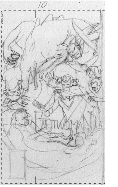
The very rough sketch for concept approval…
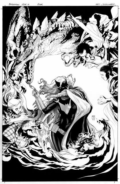
The black and white version, I decided to keep most of the rendering techniques out of this one excluding on Batwoman herself. As I wanted to get a different effect than previous Batwoman covers I’ve done…
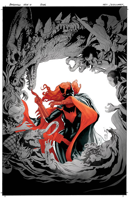
The goal was to keep things almost monochrome, or a limited palette. Placing all of the focus on Batwoman through color use. And on the encircling villains I used only simple grey textures, just enough to darken the image, while retaining the graphic quality of that portion of the cover. And then by leaving the background white and digitally painting white fades over the edges of the villains gives this very nice tunnel effect, Batwoman emerging from the light into the threatening darkness…
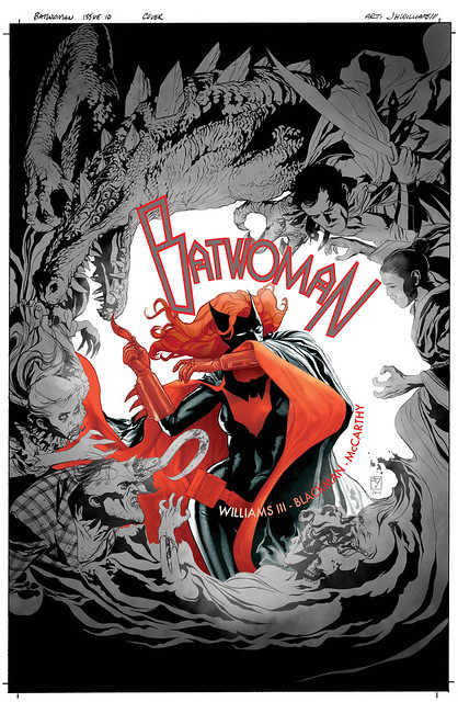
The logo and text application needed to service the design much more than usual. Reinforcing the circular aspects of the image…
28 Comments so far
Leave a comment
This is fantastic. I love seeing your process from start to finish – thank you for sharing!
Comment by Anika 03.27.12 @ 9:22 pmHmm. Anything I have to say at this point will flatter your ego too much.
Comment by Karl 03.28.12 @ 8:57 am[…] his blog, J.H. Williams III breaks down his cover process for June’s Batwoman #10, the penultimate chapter of the “To Drown the World” story arc that finds Kate Kane […]
Pingback by J.H. Williams III breaks down his cover process for Batwoman #10 | Robot 6 @ Comic Book Resources – Covering Comic Book News and Entertainment 03.28.12 @ 11:01 amSaweeeet! The piece is gorgeous and thanks very much for this insight into your process. Enlightening, indeed. (And it’s relieving to know that your thumbnails are about as chicken-scratch as mine)
Comment by Ashley Helling 03.28.12 @ 11:13 amAMAZING! I’ve got a crush on Batwoman. But since we are both gay we wouldn’t go very far. But id like to think we’d be friends and go on wild adventures in Gotham’s gay area. Maybe we would let Selina tag along too. Ok that’s enough dreaming out loud from me. Thanks for sharing with us.
Comment by Michael Wherley 03.28.12 @ 12:23 pmLove the final piece, kinda reminds me of the color scheme they used in Batman Beyond for Terry McGinnis when he donned the Batman suit.
Comment by Matthew 03.28.12 @ 6:10 pmWow – this is yet another example of you producing some of the finest artwork in the history of comics. I just marvel at your sense of detail and design. Extremely impressive. Thanks!
Comment by Jay W 03.28.12 @ 6:39 pmHey there Michael
Thanks, and yeah, Kate is so easy to fall head over heels for. I thinks thats why I’ve been enamored with her myself for so long.
Hey Jim, I just gotta ask. I’ve read numerous interviews in which you’ve talked a little about your process and how you don’t use reference much. As far as anatomical information, do you still work on that as a musician would his rudimentaries, using certain books or do you basically have it all worked out in your head. You’re skill is baffling and inspiring.
Comment by Austin 04.01.12 @ 1:49 pmHey there Austin
Thanks for the nice comment. Yeah, all true, I don’t use reference unless its for something I’ve not drawn before. As example, if I need to draw a particular gun or vehicle, I’ll look that up, work from it until I understand it enough them put it away. But when I do use such technical ref, I purposefully draw it in angles not shown in the ref material, so my imagination can build it up to what it might look like. So I don’t fret over it too much, keeping true that it’s meant to be a drawing, not an exact replica. But as for drawing people, and anatomy, its pretty much all in my head, by paying attention to people around me, sort of subliminally studying things all of the time. My brain understands the basics enough that I can safely stay away from referencing. This allows me to manipulate and create illusions of things moving in what appears to be correct ways, but if you break something down analytically you’ll probably see the flaws. Same can be said of my perspectives, they’re all inaccurate. I create illusions of it all being correct, sort the same thing a good cartoonist does. I hope that makes sense. However, I’m in no way condoning to not use reference for drawing people if you really need it. If your brain can’t remember what things look like, then yeah, use the ref. But for me, I do everything I can to not rely on reference materials, allowing me to not lose that we’re supposed to be looking at drawings. I let my imagination take over.
Very cool of you to guide us through the crafting of a cover. Not something we get to see often. One of the things I like so much about your work is your willingness to experiment with design and layout to create something unique. Love this cover.
Comment by Craig 04.01.12 @ 9:18 pmI believe I understand where you’re coming from with the cartoon analogy. Reminds me of something Adam Hughes said about how his style is not cartoon-ish or realistic but naturalistic (something along those lines.) There’s a difference. You’re creating a certain narrative, so to speak, that has its rules, malleable they maybe. I agree with you. I think using reference incorrectly can make for a lifeless and uninspired drawing and can be a crutch if overused. Maybe I should just take more figure drawing classes for the memory bank. Thanks for taking the time to comment Jim. Very enlightening, as I think I need to loosen up a bit and trust myself in my own art(maybe get away from the pencil and eraser for a bit) and remember that it’s all ultimately sleight of hand on paper, an “illusion” as you so aptly put.
Comment by Austin 04.01.12 @ 9:59 pmHello Craig
Thank you. With covers for a series I’m always trying to find ways to make each one different in feel and presentation, but yet a connected vibe when viewed together.
Hello Austin
Life drawing classes can be a good thing, but they’re still a bit contrived due to expected poses, unfortunately. I’d recommend to also go to public places and do quick draws of people milling around doing whatever it is that they’re doing. Study them in real environments. Preferably places where you can get a good mix of various actions, from sitting positions to interacting with others. Parks or restaurants, or outdoor milling crowds around shopping areas.
Wow. I mean, wow! Love it!
Comment by Pam 04.03.12 @ 8:27 am[…] Batwoman Cover 10 via JH Williams: Mr. Williams shares his process for the fabulous cover art for the tenth issue of Batwoman. I love seeing how it goes from start to finish. […]
Pingback by Things I Heart « Anika Guldstrand 04.11.12 @ 10:42 amHey, J3. I’m revisiting these old insights into your process and I have a curiosity.
I’ve been playing with the 500 series semismooth paper that you’re fond of and I’m noticing how prevalent its texture is. Sometimes this is a great thing (close-ups of skin turn out amazingly detailed, for instance) but there are times when all I want is a simple, no variation tone-mat. Closely observing your printed art reveals no paper texture in your tones. I’m hoping to avoid purely digital tone-mats if I can help it.
In short: How the *blip* do you keep the paper texture out of your tones?
Any insight is helpful. Thanks for your time!
~ Ash
Comment by Ash Helling 08.07.12 @ 10:04 pmHey there Ash
Some of it is from using copic grays, the sketch marker version with the more brush styled tips. Those inks sit on the paper differently than washes will, but are still archival. If you were to see the originals there is still a paper texture showing up though, but not as prevalent as it is with traditional washes. This is why I try to use a variety of mediums on a single page, because each provides their own unique effect signature to take advantage of. I hope that helps.
Thanks very much for the tip! I’ve been playing with copics on that surface and the results are intriguing. I like how the paper soaks up the ink in such a way that the gradients smooth out. Much fun to be had!
One more question if you don’t mind:
What do you use as a ‘traditional wash’? I’m changing how I think about inks and curiosity is setting in. This paper sure likes to curl up if the medium is too wet…
Hope you’re well!
Comment by Ash Helling 08.17.12 @ 9:35 pmCool. And yes I use traditional washes as well all of the time. Sometimes combining those washes with the copics. I basically will use any medium to gain the desired effect, so on a single image there could be any number techniques applied. Make sense?
Comment by jhw3 08.18.12 @ 1:29 amLeave a Comment
** Required but not displayed
Very nice. Wasn’t expecting this treatment when I first saw it. You always continue to surprise.
Comment by Michael 03.27.12 @ 9:20 pm