And now Batwoman 1 cover in detail…
Wednesday January 26th 2011, 8:57 pmHere is the breakdown and process notes…
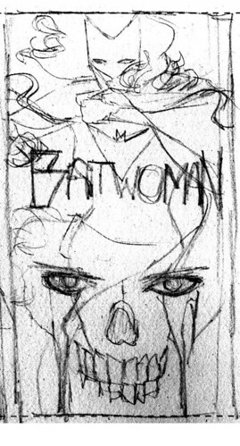
Rough sketch for editorial approval…

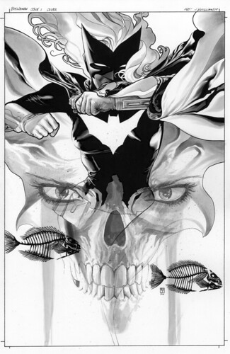
Black and white version, done with ink and copic greytones, and a little ink wash. Then some touch-ups with black color pencil and white color pencil.

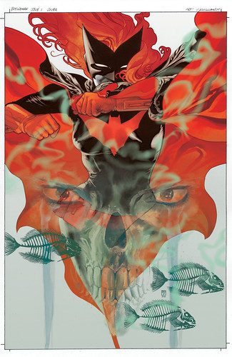
Color version using photoshop. Since I wanted the ghostly image of the new Villain to be a part of the physical artwork I had to carefully separate that digitally before coloring the piece. I felt this was necessary to better mix the elements afterward using various fx. Also I made a compositional change by adding another fish skeleton, using one of the ones I had already drawn through selection and duplication tools. This really improved the compositional balance. I also made a slight digital change to the cape near Batwoman’s face. This was important to do because the color of the untouched version looked a little awkward. I also smoothed the textures on her skin so it would have a different feel than the wash tones elsewhere. I also added some green mist to enhance the ghostly otherworldly quality of the villain’s presence to finish it off.

20 Comments so far
Leave a comment
agreed. your covers consistently blow me away!
Comment by Tristan 01.27.11 @ 5:23 pmDamn, but those are gorgeous. As always. The breakdown and commentary are fantastic as well. Now I’m curious though…how much a part does photoshop (or other digital tools) play in composing most of your art? Is it more or less difficult than simply drawing everything? Do you get to submit them using a computer, or do you have to print out physical copies to turn in?
Comment by SoldierHawk 01.27.11 @ 6:11 pmAnother masterpiece! Can’t wait for the book!
.j.
Comment by .j. christopher greulich 01.27.11 @ 7:47 pmHey there Erica
Sometimes those sorts of things are hard to sum up in words that make coherent sense. Basically I try to use symbolic ideas that can evoke emotions or tickle the brain somewhat differently than using straight forward images. Doing this sometimes allows deeper meanings to come through, makiing for, hopefully, a stronger and more memorable piece.
Hey there SoldierHawk
Thank you very much. I try to keep all of the art physically done on the art board. But occasionally I will see something that needs tweaking and its much easier to make changes digitally. Like I was saying though, the art in physical form in pretty much intact. Color though usually is done using photoshop. But there are occasions that I want to a different feel than that and then physically paint something, sometimes combined with digital color. It just depends on the effect I’m trying to get. A good example of this will be seen with cover 2 (to be posted soon). When work is done everything gets sent in on a dvd or uploaded to an ftp account.
Can I ask that you please hold offering the original art for Batwoman #1 in your store until I win the lottery?
Comment by the cheekster 01.28.11 @ 8:35 amHey there cheekster
You’ll have until at least a week after the launch date.
😉
Um, I’m quite the wordsmith today because all I can think to say when I look at that cover is … “Wow”. And I’m not even sure why but her hair is just super cool. The sort of art-deco feel of the layers … just wonderful.
J3, that is just amazing. So beautiful. You’re my hero. 😉
~ Pam
Comment by Pam 01.31.11 @ 2:29 pmDear JH,
I just wanted to leave a comment to say that I LOVE your work. Your sense of design is amazing and the level of quality & depth in your work is stunning; reading your comics is a really special and rewarding experience. I loved your past Batwoman series and really look forward to the new run.
Comment by Dan 01.31.11 @ 6:36 pmHey there Dan
Thank you very sincerely. I’m glad that you are finding my work such a worthwhile experience.
You really stand among the top comic designers and artists. Powerful stuff. Do you use a brush or pen for your ink work?
Comment by R3DF0X 02.02.11 @ 7:07 pmhi I just wanna let you know that at my local shop I found detective 821. I love the artwork in it and dini’s story is pretty good.I love how the batcave creates the panels for the bottom of page 7. Can’t wait to continue collecting your work past and present. I’m also excited to see what you’ll accomplish in your partnership with The new batwoman artist.
Comment by shaunH 02.02.11 @ 9:55 pmHey there R3DF0X
Thanks so much. I use a combination of pen and brush work along with tones and washes, and black and white color pencils.
Hello shaunH
I’m glad you’ve some enjoyment out of some of my work from a few years ago. Thanks for sharing that.
just stumbled on your site thru Kenneth Rocafort.
this is absolutely marvelous! since I saw your art in Batwoman, you immediately became one of my favorite comic book artists. you mix realism, lighting, shadows, mood and clean lines so well! keep it up man.
Comment by Geebee 02.09.11 @ 2:10 pmLeave a Comment
** Required but not displayed
When you get some time, can you speak a little to what insipres you to create your covers, as oppose to how you create them? Your covers (including Batman Inc) are phenomenal! Amazing works of art!!
Have you put a sketchbook together?
Comment by Erica 01.27.11 @ 12:12 pm