This is…
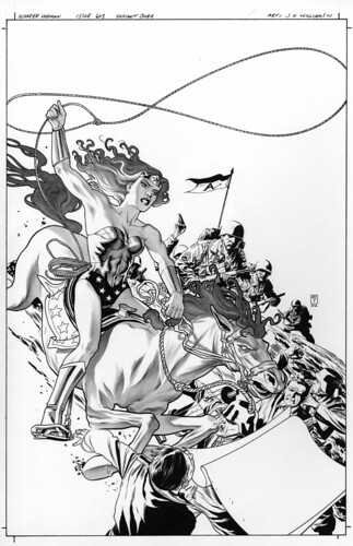
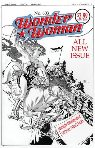
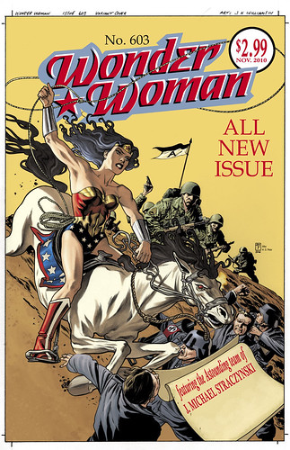
Tuesday July 06th 2010, 8:17 pmWonder Woman! A variant cover homage to Wonder Woman number one. The goal of this was to do a cover celebrating DC, there are several of these being produced this year by various artists on various titles across the DCU. Mark Chiarello asked me to do one of these months ago and I chose the Wonder Woman number one cover from the selection of choices that were presented from editorial. At the time I had no idea of the plans DC had with changing her classic iconic image, so this was not done as a statement about that. It’s just a bit ironic that this will be out soon now that they’ve revealed her new look. I hope I don’t get into trouble by saying that I think her new look is less than appealing. It seems that what made her iconic and instantly recognizable has been taken away. I can’t help but be a little sad about it. To me, Wonder Woman’s design is as relevantly iconic as Superman or Batman, there just seems to be something magic about it that works. I know there is a lot of concern that she doesn’t look politically correct when looked at through the corporate microscope, but the number of female fans that I’ve talked to about the new change exclaim to me just how much they loved the classic Wonder Woman design, and feel that this new version is a mistake. But I will reserve my judgment until I actually read the material the new look will be associated with and hope for the best. I’m just happy that I got a chance to draw the iconic version of her I know and love again. I do want to get other opportunities to find my footing with this character visually. I hope you all find this illustration worthy of the character.
Black and white version…
Text treatment by me. At the time of doing this I didn’t know who was going to be the artist, so thats why it’s left with just the writer be listed here…
Color by Dave Stewart
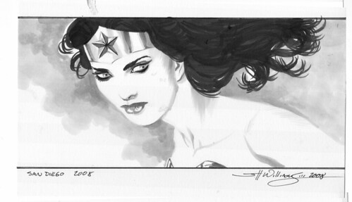
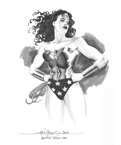
And here are a couple rough con sketches I did a while back…
11 Comments so far
Leave a comment
Apologies. I should have read through, where you answered the costume question. Was just jazzed up by the illustration!
Comment by DF 07.06.10 @ 9:16 pmHey there DF
Thank you. Glad you like the handling of her eyes. I agree they should be strong and confident but not looking tarted up or masculine either.
Great homage there and I agree, the eyes definitely have “it”.
Totally agree on the costume front, I think attempting to change such an iconic look is a serious mis-step. Let’s hope it doesn’t stick when JMS ends his soft – alternate timeline – reboot.
Hope to see you doing more Wonder Woman soon – the ‘real’ iconic Wonder Woman
Comment by Karl 07.07.10 @ 2:09 amWow!
Those are wonderful. Truly. Iconic for sure, and yes – just as captivating as Batman / Superman and just as important.
And for the record – I sincerely agree – the eyes are amazing. I think the eyes on each of your illustrations are always a high point.
Yeah, and for the record … I can’t stand the new WW costume. She looks like one of the less popular Spice Girls from the late 90s.
Comment by Pam 07.07.10 @ 6:11 amI liked the cover, but what called my attetion when I first saw it, was that it was chosen as a variant for WW 603, and it features a completely different look just when everybody is adjusting to the new costume… of course I read your post later and it made more sense to me.
What I don’t get is that the costume that you chose for the cover doesn’t quite match any of the versions I know (it looks like the Pérez version, but not quite).
Why did you choose this particular costume against other possible options? (like the one from the classic original cover).
Comment by Esteban Pedreros 07.09.10 @ 3:43 pmHello Esteban
There was no real thought into which version I was doing. I just drew what I felt like drawing at the time. The only editorial edict was for it to be an homage to the original composition.
Nice look for this cover overall, but the anatomy on WW is way off (sorry to have to point that out). Her head and torso are extremely big and her lower body and legs very small. It actually looks like the perspective is in reverse: since our line of sight is low her legs should look big and long and her torso small, her head even smaller. Very weird effect!
The horse also has a bit of a greyhound look but maybe that was wanted.
I appreciate your opinion, but I have to disagree with you. The head thing you’re seeing is the illusion from her billowing hair. The legs is due to a slight foreshortening from the angles we are seeing things. But over all, the effect I was going for was a for a somewhat weird one anyway. The original has this oddness to it’s details that I wanted to sort of capture. Wonder Woman’s positioning is strange on the original there also. The horse on the original has this otherworldly fantastical beast quality to it, I mean it even has red eyes in the ref I have. So I wanted to emulate that same feel of this exaggerated creature of a horse. I also wanted to do the opposite of the original, where WW is quite small on that horse. On my version, I made her Amazon stature very obvious, roughly 6 1/2 to 7 feet tall. Sorry you don’t care for it. It’s all a process of learning.
Comment by jhw3 08.19.10 @ 1:22 pmLeave a Comment
** Required but not displayed
Outstanding. What a regal and gorgeous Diana, not to mention a terrific homage to WW #1. Your renditions truly capture her beauty and strength, especially in the eyes. So many artists seem to forget how powerful eyes can be on an illustration.
One question: was the new costume still a mystery when you composed this beautiful cover?
Comment by DF 07.06.10 @ 9:13 pm