Out this week!
Wednesday January 23rd 2013, 12:09 amBatwoman 16 hits all finer comics shops now.
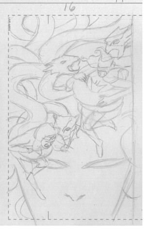
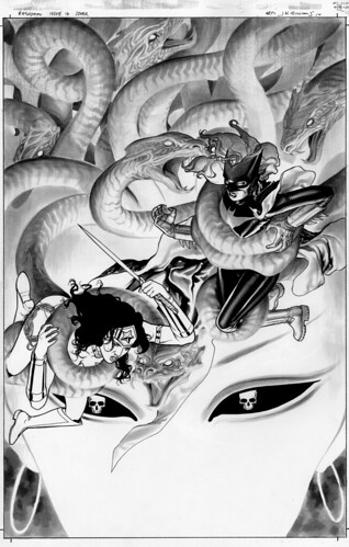
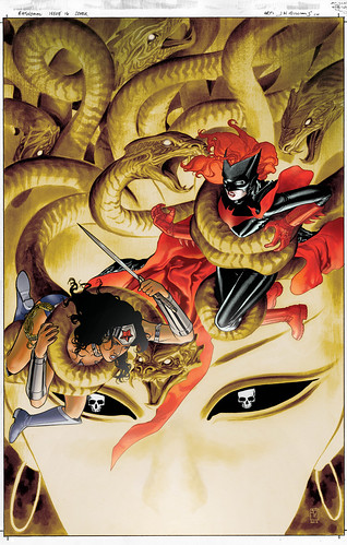
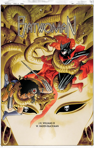
Here is the cover in process stages…
Editorial approval sketch…

Black and white rendered version…

My color version. Here, whence I saw it in color I felt the the noseless Medusa didn’t really work in this version. So I digitally painted one in very subtly as to not interfere with over effect…

My logo placement version. The print version of this has another one of those annoying Arrow TV show banners across the top. But here you can see it as it its meant to be seen…

19 Comments so far
Leave a comment
I just finished reading it, and I was absolutely fascinated by this issue. Every single page was fantastic. Love your work!
Comment by Nahuel 01.23.13 @ 1:48 pmWhen I got to the last page, I was like “That’s it? I NEED MORE!” Sometimes the 20-page limit can be infuriating to a comic book reader. Also, love a certain new hero’s outfit design.
Comment by Suzanne 01.24.13 @ 6:36 amI haven’t posted on the blog in a while. Last issues departure was jarring, but this issue was all I could ever hope for from a superhero comic.
Epic in all proportions.
Cheerworthy cameos.
Crossover perfection.
A character’s triumphant appearance.
Wow, what a great mythos Batwoman is surrounded with.
Thanks for making my lunch break so awesome.
Comment by j.davis 01.24.13 @ 12:44 pmHey Suzanne
Yeah 20 pages can be too short lived. Harder even writing to that page count. And glad you like Bette’s new duds.
Hello j.davis
Issue 15’s Interlude 2 was meant to feel as it did, much like having the 0 issue be Interlude 1 which falls after the first chapter of this same arc. We feel both serve as stories within the story. Something I’ve loved ever since first seeing Crouching Tiger Hidden Dragon. I loved how that film gave another story in the middle of it. So when this arc is read as an entire book (as all arcs sort of should be in my humble opinion), the narrative takes on a more unique structure, much like that film does.
And I’m thrilled that 16 hits it on all levels for you. We’ve been building to a trilogy climax, and now you’re in it ;^) Thanks so much reading Batwoman.
Comment by jhw3 01.25.13 @ 11:23 pmPaying a visit having saw the cover got mauled again; I know this isn’t helping but I hate how the banner obscures that top snake’s head and the lower part of Medusa’s face has been trimmed. Grrrr! So – thank you for putting the original up here 😉
#16 was really great – just finished it; the script was dramatic enough to keep up with your art and I loved the center-page spread of the hydra. Like you say above, its clearly building up to its climax. Thanks again.
Comment by David Rand 01.26.13 @ 1:15 pmOh nuts … I keep getting an error on the “Enter Security Code” feature ( and I’m sure it’s HAL9000 saying it) but I just have to comment : Holy Flipping Wow! What an awesome issue! Just excellent in every way. I’m out of breath just from reading it. My compliments … this just keeps getting better and better!
Special shout out to Todd Klein, because his lettering really helped pace and define the story!
You guys rock !!! Awesome job, J3! Just amazing!
Comment by Pam 01.26.13 @ 2:25 pmI’m watching last week’s Face Off on the DVR and I think you were one of the artists. True? For some reason you were the only artist not identified. Was it fun to participate?
Comment by Craig 01.28.13 @ 8:25 pmHello J.H. Williams III, I am much enthused by your art, as it is this evocative, organic quality of that is all too rare in an era of streamlining. This many layered, kaleidoscopic approach is teeming with inventive ideas, a passion it seems for expanding the form! The results are truly unique, as is the use of the wash and thinned out ink(?)line. The coloring technique is wonderfully handmade looking, and a clever use of PH. I like that you allow for some room improvise on the page, that’s what I do. Man, I am curious to know the process. Maybe you’re collaging the various forms with tracing paper than transferring them to the final page, via projector or graphite rubbing? So many questions, and I know you’re occupied. Just had to voice my enthusiasm and support.
Comment by Dave 01.29.13 @ 12:07 amHey there David Rand
Thanks so much for kind comments. And those banners are annoying as hell.
Hey there Pam
Not sure what the error thing is that you’re experiencing. But it looks like you were able to comment here, and such nice things to say as well, thank you! And Todd Klein is aces.
Hey Craig
Yep the beard was me ;^) And apparently my unnamed credits were hiding under my bristly hair… As for how fun it was? It was a long day for only a few seconds of screen time, so eh.
Hello Dave
Thank you so much for the very kind words. You humble me me, sir! And 99.9 percent of everything you see is on the actual drawing board. You can find some examples in the flicker gallery.
hey J3
Totally off topic, but I see from pics at the NY Toy Fair that there is FINALLY a Batwoman statue coming out!!!
Was this designed by you?
hope you are OK
Alex
Comment by Alex 02.14.13 @ 11:15 pmHey there Alex
Cool stuff indeed. But unfortunately it wasn’t designed by me. I wish I could’ve done it.
yeah, I thought it was too much to ask for. But at least we are getting one!! Do you know who did design it? Also this might interest you.
She reminds me of a young Jodie foster, no? Too cute!!
Comment by Alex 02.20.13 @ 4:44 pmLeave a Comment
** Required but not displayed
YEEEEESSSSS!! 😀
Comment by Ash Helling 01.23.13 @ 11:04 am