Batwoman 13 Cover Stages
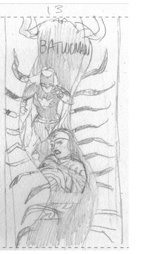
Thursday October 11th 2012, 10:48 amFirst up is the very crude rough for editorial approval…
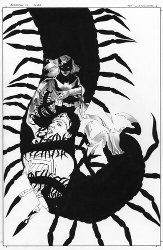
Then here is the black and white. Note the composition has been altered, improved upon. This enhances a sense of movement, but it was for nothing, you’ll see what I mean on the final stage…
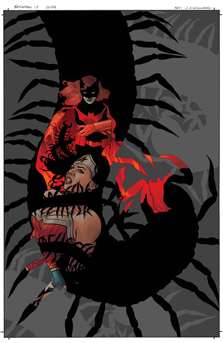
Here is the color version by me. Batwoman had yet to really use a dark cover, and there is a point in the story that lended well in going for something black and dark grey. Its at this stage that I added additional shapes into the background grabbed from the main centipede shape, this allowed for some needed layering to the composition. I hate relying on digital tricks like this, but sometimes its necessary. And its an idea that didn’t occur to me until the coloring stage…
Now here is the logo and text version I turned in. You’ll note how well it compliments the movements and composition in an interesting way without interfering with the shapes, it works with them simplistically to gain an added sense of design…
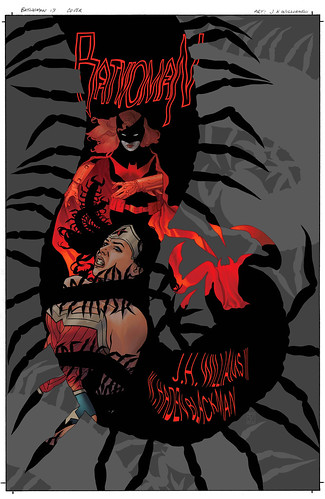
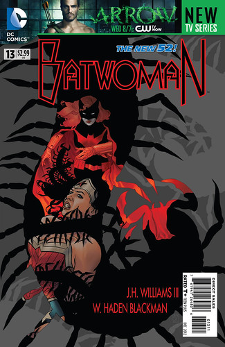
Now this final stage has nothing to do with me. This is all DC. There was insistence that the covers use the Arrow banner, a last minute add on into the process, something I had no control over, so they had to lower the image a bit to accommodate. I get that they sometimes use that space for banner adds, but what I don’t like is when I’m not told in advance so I can design around it. Then the logo and text was changed to something I feel is way overpowering to the composition, they felt the first version was too confusing, which I disagree with. Since the image had to be lowered to allow for the banner add note how the upc box on the lower right corner interferes with the movement now. All of these changes work against the composition greatly, the result looks like something scattered and undesigned, like something thrown together…
27 Comments so far
Leave a comment
Wow … super cool! I love the use of the black space for Batwoman, the detail it gives, the contrast, is awesome! Well done!
Keep up the great work!
Comment by Pam 10.11.12 @ 11:28 amWth, why does DC have to be so stupid with their advertising? I don’t want a giant banner on my comic cover! I’m not going to remember “Arrow” 30 years down the line, I’m going to remember batwoman!
UGH. Atleast, if they really wanted to put an advertising, give it a page spread INSIDE the comic!
/RAEG
Comment by Ramona Nahapetian 10.11.12 @ 11:30 amI’ve only been buying comics in issues since the New 52, but already those banner ads are the bane of my existence. The comics look worse, and I just don’t buy that a significant enough proportion of the readers that weren’t going to watch Arrow now are because DC chose to paste that all over our comics.
It’s this kind of thing that’s got me buying less and less DC and more of Image and the like (that and the quality of the comics). Plus most comic readers tend to be relatively media-savvy, have internet access and all the likes of CBR, iFanboy etc. are talking about little else besides Arrow and Batman #13 today anyway.
Comment by Rory 10.11.12 @ 1:21 pmHi Ramona
Yeah, I seriously dislike the banner thing too. But obviously they feel it works for them enough on some level to warrant its use. I just wish I had forewarning so I could design with it in mind.
Hi Rory
I suggest you write DC and Warner to tell them your opinion ;^)
Why Doesn’t DC put the UPC on the back like other comic companies?? Yarg! The banner is stupid too. I’m sorry your great art was modified.
Keep up the good work!
Hello Roque
I think they don’t place the upc on the backs because of the sold add space interference. But thanks for the uplift.
I winced a bit on your behalf when I scrolled down to that final image JH…
Comment by David Rand 10.13.12 @ 10:32 amAt least the TPB/HC reprint won’t have that ugly add on it. JHW’s covers wold be AMAZING as posters 🙂
Comment by Said 10.15.12 @ 2:13 pmWhelp, that’s the life of an illustrator. You could always do your own series at Image or become a fine artist.
Comment by Mike McDowall 10.16.12 @ 12:40 amYour original image is fantastic, i hope that’s the one they will use in the collected edition’s cover gallery.
Comment by Cassidy 10.17.12 @ 6:44 pm[…] Greg Rucka, has a whole flickr set dedicated to his work with Kate Kane donning the cowl and gives this glimpse into how he created the cover for #13 (with grievances about the final design decisions.). In […]
Pingback by J. H. Williams: Batwoman + Wonder Woman 10.19.12 @ 6:01 am“Leonardo what were you thinking ?. Is she smiling or not ?, it’s confusing. Draw a smile on her will you, people need to know what they are looking at. There’s a good chap.”. We’re all lucky DC Editors weren’t around back then.
It’s disappointing when an editor feels the need to interfere with the composition of a final image in this way. Taking the titles out of the centipede badly affects the fluidity of the artwork. It’s not as if the text was unreadable or the titular character wasn’t on the cover.
I think right now editors time would be better spent focussing on the whole process. Errors and rushed art are becoming commonplace in the nu52 output. I suspect this is due in many cases to an increasingly short time span between scripts being delivered to artists and the deadlines to deliver completed work. Editors ensuring earlier script delivery and applying better QC on the interior work is what we need not this tinkering.
Great to see the original art before colors went on.
Comment by Karl 10.19.12 @ 8:51 amthanks for posting your work flow. this is one of my favorite Batwoman covers since the first arc. i’m really digging the use of greek mythology with Batwoman’s own gotham-underworld-mythology.
hopefully DC will hear enough BOO’s to get rid of the banner marketing.
you guys are doing an amazing job with Batwoman! I hope you stay on the team for many years to come 🙂
Comment by Alec 10.25.12 @ 4:11 pmHey there Alec
Thanks for the encouragements on my posts and our work.
a very nice review of Batwoman 13 http://www.afterellen.com/content/2012/10/batwoman-and-wonder-woman-become-bffs-batwoman-13
enjoy, jhw3
Hello Rousefolle
Thank you for the very kind write up, we’re so happy you’re enjoying our efforts so much.
just to be clear, i only found this review, don’t want to get sued for IP theft:)
It still does however reflect thoughts on Your great art.
Have a nice weekend!
Hello again Roussefolle
Ah, my oversight, but thanks for clearing that up for me ;^)
Leave a Comment
** Required but not displayed
[…] J.H. Williams III blog #gallery-1 { margin: auto; } #gallery-1 .gallery-item { float: left; margin-top: 10px; text-align: […]
Pingback by BATWOMAN #13 COVER BY J.H. WILLIAMS III | Dark Knight News - The #1 Site For All Things Batman 10.11.12 @ 11:20 am