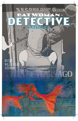
Detective Comics 858 cover (in stages)
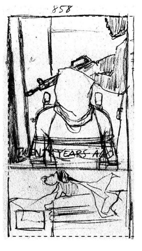
Saturday August 22nd 2009, 12:05 pmStage 1- Rough sketch done for editorial approval. The concept was verbally communicated over the phone…
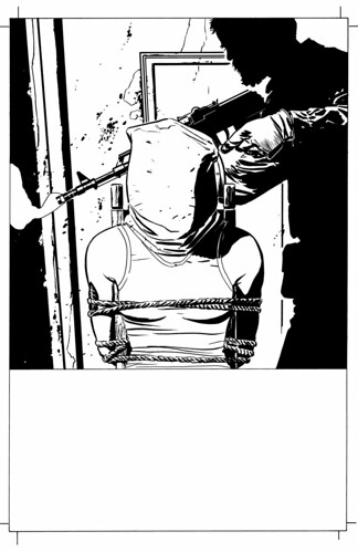
Stage 2- Ink drawing of top area of design.
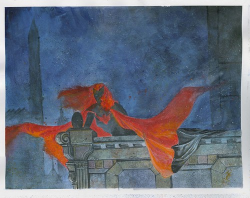
Stage 3- Painting for bottom area of the design
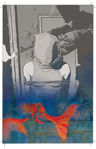
Stage 4- Digitally coloring/toning the top area. Combining stages 2 and 3 by sort of blending or melting them together. Digitally enhance the colors of the painting, giving more vitality to the palette.
Stage 5- Add logo and text, finishing off the design concept.
18 Comments so far
Leave a comment
The bottom half of stage 1 looks like Snoopy riding his doghouse wearing a cape.
By the way sir; I wanted to mention how amazing your art is. For my money you’re one of the best in the business.
Comment by Adam Relayson, New Orleans Comic Book Examiner 08.23.09 @ 6:45 amHey there Adam
I’m not sure I understand the Snoopy thing, but okay.
Glad you like what I’m doing with my work.
Comment by jwh3 08.23.09 @ 11:54 amWow, J3, thanks for the preview. Awesome cover, just amazing. I love the emotion conveyed in all the sketches, even the most preliminary.
Very impressive.
~ Pam
Awesome. Awesome awesome awesome awesome AWESOME.
I also really like that you gave Dave Stewart cover credit.
Comment by ScottyQuick 08.24.09 @ 8:59 amHey there ScottyQuick
Thanks very much. And yeah, I’ve been putting Dave’s credit on the front of every cover but it is DC who removes it for some reason beyond my comprehension.
Very powerful cover; I love the way the painting melts into the grayscale. Was the two-part design meant to be reminiscent of the 854 cover?
I’m so excited for the origin arc!
Comment by Aria 08.24.09 @ 8:05 pmHey there Aria
Thank you. It wasn’t meant to directly remind people of the first cover, so it’s interesting to me that it does that for you. For some reason my mind keeps going to having dual images on these covers, so that is where the ideas are coming from.
One of the few books I buy these days. Good to see bits of how it comes together. I’ll be reading as long as you and Hamner remain on the book. Keep up the solid work ethic, hope you get better.
Comment by kudamono 08.25.09 @ 8:11 pmThanks for the insight into your process, really loving Batwoman,If I’m honest I only picked it up because you were drawing it,but I’m really enjoying it, it’s up there with the Morrison/Quietly book even if it’s not as over the top.
Best wishes James
Comment by James Corcoran 08.31.09 @ 1:23 pmI was just showing this series to a friend and was wondering if you use the same steps/stages for all your covers?
Comment by Pam 09.09.09 @ 5:09 amHey there Pam
I would say no, because each cover concept is a little different from each other. Although, the 3 covers done for the origin arc were all done using this same process as shown above, with the third being handled slightly different. But with next arc I will probably need to change the approach again entirely.
Ha ha, Snoopy was the first thing I thought too, before I even saw that comment.
Comment by Kim Scarborough 09.27.09 @ 9:58 pmGreat post! You gave me some very interesting ideas. I am looking forward to read rest of your blog posts.
Comment by Myrna 03.22.11 @ 12:21 amLeave a Comment
** Required but not displayed
Lovely. How on earth you do all of this AND the book is beyond me. The painting deserves it’s own step by step.
Comment by Karl 08.23.09 @ 3:13 am