Thursday March 19th 2015, 1:03 pm
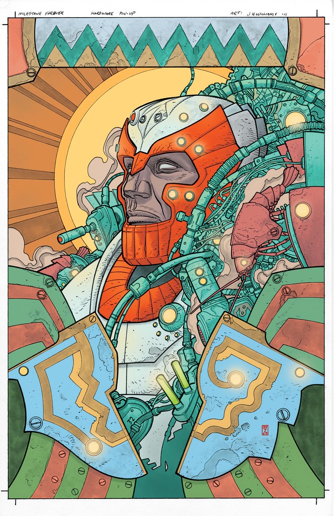
This week is another lesser known piece. Very early in my career I wasn’t getting work, couldn’t get anyone to pay attention to my stuff. Not until meeting Howard Chaykin, who in a single hour at a con became my advocate at the DC booth. He got eyes on my samples, forever changing my life. And from that came business cards, and from that came probably at least 80 pestering phone messages left by me to offices in NY until one day somebody decided to call me back. That somebody was Milestone, the forward progressive thinking venture that was supported by DC Comics at the time. Looking back at the quality of my work back then, I probably should NOT have been given a job, but I was. So I did my best to make it as good as I could. It was fill-in work on Blood Syndicate, a very interesting and diverse group. That lead to Deathwish for Milestone, another progressive forward thinking mini-series that partially dealt with lead character transgender issues within the frame work of crime fiction, interesting thoughtful material. Again, I did the best I could, I was improving. I loved Milestone, some really great comics came out of there, and was proud to briefly be there. I wish it had continued, it deserved to be an ongoing success, doing comics with fully fledged diverse characters works, this should be a no-brainer. It’s a bit disheartening to think that there still isn’t full on equal diversity within mainstream comics. It’s certainly better than it has been in the past, but there isn’t anything currently on the shelves as full with it as Milestone was. So I suppose that because where and how my career over time has moved, the types of stories I’ve engaged throughout, that even though my skills weren’t really up to snuff I did start where I should have. A type of thinking I believed in, that continues to this day. So the piece I’ve selected is from much later but relates in that it is from a Milestone special published many years later, now that my skills were really better. This time I was given the opportunity to pick the character, I chose Hardware, one of Milestones more famous concepts. Later I also did a Static Shock piece, Milestone’s most well known character, I’ll post that another time. With Hardware, I thought there was something about the tech-armor character interesting to the eye. I decided to go with the man in the machine aspect. But wanted to find this strange hybrid of influences coming together– a vaguely Kirby meets Moebius meets African folk-art thing– something that wasn’t the typical action pin-up or glory shot. I kept the colors bold and direct, which I think helped push some of what I was after. One of my favorite bits in the piece are the indications of little mechanical crustaceans. I have this obsession with placing references to sea life in my work where I can get it in. The image is a decent file, but if I come across a higher res version in my archives I’ll switch it out, but at least for now you can see the design intentions clearly.
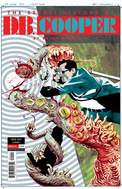
Tuesday March 10th 2015, 12:29 pm
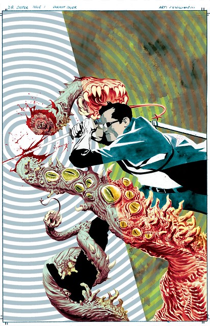
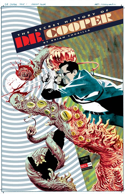
Today I’ve selected another piece not seen much. The very talented Brian Churilla created a uniquely cool series called The Secret History Of D.B. Cooper, published by the good people of Oni Press. It has this wonderful mix of strange mystery and surrealism that I really could get into. They asked me to do a variant cover for the series. Brian was going for a sort of pop art very graphic nature to the covers for this, so I wanted to do the same but without duplicating the exact feel of his images, to do my own take. The story dealt with alternate realities with touches of noir. I decided it would be interesting to really play that up for the composition, showing Cooper crossing realities through use of a very simple split composition that acts as a device of seeing the character in two realities, but more symbolically and through use of action movement, having the art change in style and techniques depending on which dimension side you’re viewing while also remaining one single image. By use of textures and style changes, keeping the backgrounds very simplistic allows for all of the focus to remain on the action. And as that action crosses into another dimension it was key in having that transition line be very simple, almost subtle but not quite, to not interfere with the action immediacy. The really fun part about this idea was showing this hint of a Lovecratian creature crossing through the dimensions, and having its colors shift depending which dimensional side you look at, and then do the same idea to D.B. as he is on the attack. I’m displaying the piece below without text, and then two versions of the logo treatment. The first logo treatment was attempting to play on the dimensional dividing line in the art, applying that to how the logo and text fit compositionally with the image. A decent enough idea, but it was decided that it just wasn’t popping enough, so the second version is what we went with, it pops with a little more color. As fun as it was to do this piece, it was so much more fun getting to read the book, which everyone should do.
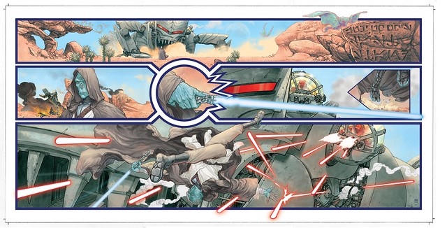
Tuesday March 03rd 2015, 3:02 pm
The piece I’ve selected this week was something I never thought I’d ever do: Star Wars! A few years ago I was contacted by the Lucas people saying that they were going to produce an Art Of Star Wars Comics art-book, and they were interested in me contributing something for it. I was quick to point out that I’ve ever been involved in doing Star Wars comics except for 3 covers I had done for a mini a long time ago. I wasn’t known as a Star Wars artist. In reply, that didn’t matter, that they were selecting from a small group of people to commission new pieces. I asked if I could create my own character, something new, since it was going to be a new piece. Yes! I wanted to do that because I had an idea for a piece that was to feel like a snippet of a Star Wars story we hadn’t seen. And I also wanted it to be be a very subtle homage to Jack Kirby giant monsters. But instead of it being a creature, it’s a giant war machine that looks like a creature, piloted by empire troopers. The idea was that it was facing off, like a western showdown, with one lone jedi on some alien desert world. The jedi being the lone hero in the face an evil invading force. I also wanted this to not feel like my typical work in terms of techniques. I wanted it to feel like something closer to classic fantasy illustration. The result is a wide fold out image of sequential art, not a splash poster type of thing. I used the width of it to loosely convey in design for the middle tier of panels the vague shape of a lightsaber, as the actual lightsaber in the story flickers to life. The entire image was rendered in black and white greytones, ink, and ink wash, then scanned into photoshop and digitally painted it. Normally for something I paint I do that work physically on the board. But with this I wanted to make absolute certain I had completely control over the clarity of the colors, so I went with digital paint. This also was helpful in keeping the design work very clean. The odd thing was that the hardest part of the entire image was getting the lightsaber and laser fire to look correct, graphically solid but still feel like energy bolts and blade, to feel like Star Wars. It was surprisingly difficult to get that effect cleanly. Looking back on it, I wish I had the lightsaber flickering to life in those middle panels with the blade running completely off on the right side of the page, literally coming out of the images entirely. Ultimately though, I think the sequence is relatively successful in capturing the feel of Star Wars, slightly filtered through my own sensibilities.