Thursday March 31st 2011, 12:01 am
My good friend, Scott Johnson, who is working with me as a co-writer on an untitled graphic novel project, has a new comedy venture in Las Vegas, Nevada. Its going by the name Feed The Monkey.
The show is every thursday night, 10pm at the Casbar inside the Sahara Hotel & Casino. Its a sketch comedy show. Scott wrote many of the skits performed and acts in it as well. this thursday the tickets are $15 cash at the door, every recurring thursday til they bring down the house is 19.95 plus fees.
More information is below.

Feed The Monkey Sketch Comedy Show, now backed by M. Walter Pitchman Productions, is set to take the glitzy stage of the Las Vegas Strip as they play the Casbar Lounge at the legendary Sahara Hotel and Casino Thursday, March 31st at 10pm and every Thursday moving forward!
Feed the Monkey is a sketch comedy troop that has been playing in the Las Vegas area for just about three years in various areas around town which include The Onyx Theater and the now defunct Town Square Theater. After almost a one year hiatus, the Monkeys are back with a vengeance, set to play at one of the most legendary Hotel and Casinos on the Las Vegas Strip; the Sahara Hotel and Casino. The Sahara has housed celebrity comedy acts such as Bill Cosby, Don Rickles, George Carlin and of course the legendary Rat Pack, just to name a few.
With the talents of local actors such as Ryan Remark, Jillian Pizzuto, Scott Johnson, Drew Yonemori, Margeret Menzies Gonzalez, Jeremy Knowles and co-founder of M. Walter Pitchman Productions, Jon Paul Raniola just to name a few – you are certain to have the most side splitting, jaw dropping, straight up hilarious time during this hour and fifteen minutes or so performance!
You can follow Feed the Monkey on Twitter for more updates and you can also find them on Facebook. Come and take part of Sketch Comedy that eats your head!
Sunday March 27th 2011, 11:06 pm
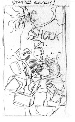
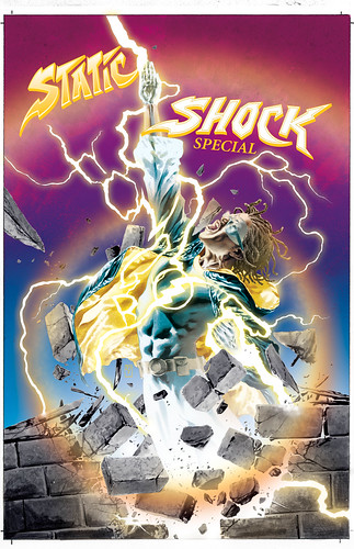
STATIC SHOCK Special
Below is the cover I just finished for the Static Shock Special due out some time in the near future. I wanted to try some different things in attitude. The Milestone characters always had this unusual quality to them, which I think made them pretty cool. And some of them seemed to have this Funk aspect to them. Now when I say Funk, I’m referring to Funk Music. So I decided to see if I could bring that more forward in attitude for this cover. The result is pretty effective. It still has this iconic quality that the genre should have, but now it feels like Funk meets Superheroes to me. Resulting in something different than what I usually do.
So here is the breakdown as always…
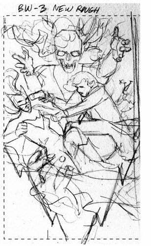
This is the rough sketch for editorial approval.
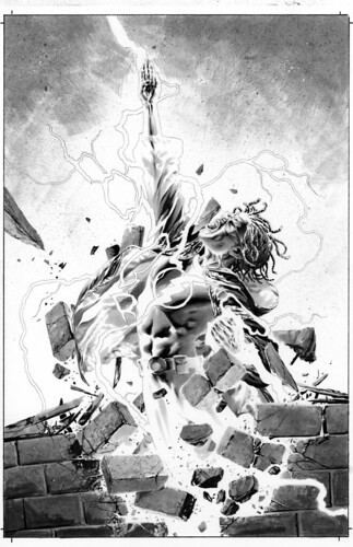
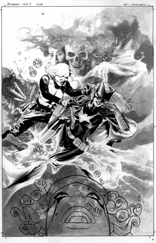
Here is the black and white version. I was dissatisfied with the idea in sketch form, it didn’t feel iconic enough, or elegant enough. The trick to doing iconic superhero images these days is that they can feel a bit redundant or generic. The sketch is a bit blah to me. So in this black and white version I focused on making the pose more elegant in it’s movement. I used all copic greytones this time around and no traditional inking. I combined that with some black color pencil work and a little inkwash, and then final touches of white.
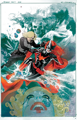
Here is the color version, done using photoshop. In the black and white I knew there was quite a few elements that I wanted to convert to color and remove some of the line work. The color was going to play a very important role here capturing the attitude I talk about above. So I used some unusual palette choices to get that feel I was going for across. I tried to use colors that fit the character but also fit the theme or my idea of Funk Music. The end result makes some of the stereotypical aspects of the iconic image recede and something bolder come forward. I’m pretty happy with it.
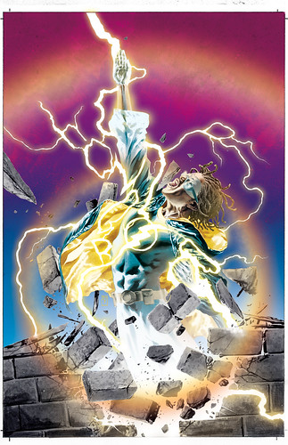
And finally the logo version. This was tough because the logo for this character is a very awkward style. Making it fit in with what was happening on the cover but stand out was challenging. The end result definitely fits into the Funk Music mentality that I was trying to convey. Hopefully its now a cover that will pop off the shelf from whatever is next to it.
Thursday March 17th 2011, 9:43 pm
Not much to report since last week. Working away on pages. Issue 3 is shaping up nicely so far. Had a bit of St. Patricks Day fun, watching Darby O’Gill And The Little People this afternoon. Although a bit down due to all sad events in Japan. I can’t imagine the nightmare that situation is for them. My heart goes out to those people.
In the CD player this past week…
Lena Horne
Fitz and The Tantrums
Antony and The Johnsons
Journey
Noir Desir
Motorhead
Janis Joplin
Raveonettes
George Thorogood
Marilyn Manson
The reading this week…
Steve Pugh’s Hotwire
Fucking amazing! The art is so good I’m jealous.
Michael Moorcock: Hawkmoon, The Jewel In The Skull
I’ve been on a kick for all the imagination this author has to offer for quite some time now. There have been a few recent re-publishing efforts on his work. I’m determined to read his entire cache of books. I’m thoroughly addicted and cannot recommend his work enough.
TV Watching– Justified, Pillars of the Earth, No Heroics, Glee, and Fringe
Saturday March 12th 2011, 12:33 pm
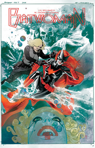
Well, its obvious to many that Batwoman’s release has been pushed back yet again. This was not our choice, and as to why, I’m not at liberty to really discuss. So the release may be farther away now, but be assured that work is still commencing. The upside to a later release means that gives us plenty of time to get a lot of issues done. Amy has turned in some variant cover work for the series and has shown us thumbnails for issue 6, looks really nice. So while I’m moving forward, she is too, we’ll have my arc done and hers well on it’s way to completion by the time this thing rolls out. The only real downside is that solicits were pulled on us twice, making readers heads spin, wish that didn’t happen, but it has, lets just make the best of it. I’m fast approaching the middle of issue 3’s interior art, Haden and I’ve started working on script for issue 8, the first 5 covers are done, and Dave has had issue 2 in his hands for his special magic touch.
Its a bit ironic that the release has been pushed back again considering that DC decided to show preview pages this same week. I too was going to be showing the cover to issue 3 in a couple weeks for when that issue was to be solicited, now that solicit isn’t happening at this time. But I’m going to show it anyway right now, to keep spirits up.
Here is the rough sketch done for editorial approval…
Here’s the black and white version. You can see quite few elements were added or altered based on the sketched rough above.
Now the colored version by me, using photoshop. At this stage I had planned on adding that zigzag design motif that is indicated in the rough sketch. But after seeing it this far along, it just seemed wiser to keep the design a little more simple. I’ve been feeling that way about most of the new covers for the series so far. I’m not sure if has to do with the psychology of them, being more on the horror side. But it just feels right to leave off some of the flourishes I tend to do, this time around.
And here is the logo. This was a bit tough to figure out properly because I didn’t want it to be intrusive, but it needed to stand out too, graphically. And there were some space limitations to contend with as well.