Tuesday June 29th 2010, 10:48 pm
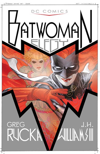
Today sees the release of the Batwoman: Elegy deluxe hardcover. I’m extremely proud of the work Greg Rucka and I did on this and even more so now that I’ve seen a copy of the hardcover version. It reads beautifully as a single body of work and has more resonance in this form than reading it one chapter at a time each month. It feels so much more like a book now than before, a more substantial singular reading experience, not just a collection of individual issues. I’m really happy with that aspect, it’s what we were hoping for and worked toward. My time working with Greg on this was a real pleasure that I will always cherish. I’m also amazed at how superior the printing is on this compared to the stapled comics. It looks so much nicer! Not because it’s larger sized, but because there is so much more clarity of detail. Dave Stewart’s colors have so much more vibrancy, and some of his special fx are so much more prominent. The tonal work I did on the black and white art shows up much better, in the stapled versions we had places where it was blackening in a bit, thats not happening anymore. Its very interesting to me, and a bit frustrating, just how much was being lost in places on those stapled versions. But it’s nice to see it correctly now. If you have the stapled copies and you do go and buy this as well, I think you’ll be very happy you did when you compare the quality of production. The book also has a very nice introduction by the wonderful Rachel Maddow, and there is some script samples along with black and white printing of some of the art. A nice package, especially when comparing the printing quality to the stapled comics.
The image above is the real cover for this, don’t believe anything else you might’ve seen for solicitations at various webstores. The cover is designed and colored by me, and I designed all of the text for it as well.
And in honor of this book coming out, below are photos that were taken a few months back at our local comic shop’s grand opening event. As you’ll see there was a lot of surprises and geek out madness to be had. The photos were taken by Daniel Kessener.

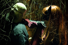
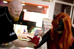
Heidi Kessener as Kate Kane
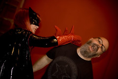
Batwoman attacks!! Heidi Kessener is under that mask and thats me she’s smacking around. The costume was made by Teresa Ozuna. She did a wonderful job I think!
She’s roughing me up!
She’s making me squeal now.
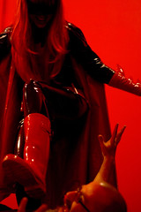
I’m done for!
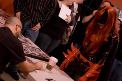
Now that I’m beaten, she wants a signed comic, she won so I had to give in to her demands.

Local Forte business owner gets it!

Now they’re friends.
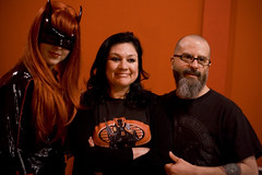
Batwoman and me posing with costume maker Teresa Ozuna.
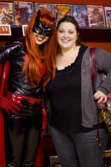
Batwoman with our friend Christina.
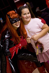
Batwoman has made new friend.
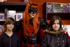
And she’s made even more friends.
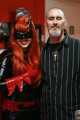
Batwoman is here with Red Sky Comics shop owner Mike Smid, he looks a little overwhelmed.

No one can get the drop on her.
She single handedly defeats Scott, Red Sky Comics business partner.
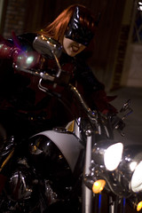
Victorious, Batwoman rides off into the night!
Tuesday June 22nd 2010, 11:20 am
Well, it’s been a bit since my last post. I started the art for the first issue of the new project, finished the first issue script, and we had begun writing Amy’s first issue of her storyline too. Then my computer went out to lunch and never came back. So I needed to get a new machine it turns out. Production slowed way down because I’ve been without a new machine for a couple weeks, it finally arrived and we were up and running again. Then we started to run into editorial issues and so production slowed again, but hopefully all of those have been resolved now. More details on this later. And along the way we’ve lost our editor to Disney. I’ll be sad to see him go, we’ve been working together for a couple of years now and I’m having trouble picturing moving forward on this character without him. I’m starting to feel like a rock band that keeps losing it’s original members. It’s just, Dave, Todd, and myself left now. But the new blood of Amy and Haden should prove to be invigorating. We don’t know who will be the new editor for sure just yet, but production will continue anyway.
It’s been a bit crazy dealing with DC and not having my work machine and trying to get things done. But now we should be returning to normal and I can get back to posting here more often.
A week or so ago saw the release of DC Universe Legacies #2, which I contributed art for a variant cover and an 8 page story written by Len Wein. Its about the original old school 7 Solders Of Victory. I tried doing something different with the layouts of the story. I’m not too sure if works or not, I think it does just okay in spots but is really effective in others. It’s very busy I think. The story had a lot crammed into it’s 8 pages for the action, I think it would’ve benefited from having more room on the page count. It felt like a 16 page sequence crammed into 8. There is a lot going on in it as seen, but even with everything that is there I had to cut a bit from what the plot was calling for to try and streamline the action more. But I feel it still has some problems. Other than those concerns it’s an interesting experiment on layout and style manipulation, worth trying. If any of you have read it I hope you like it.
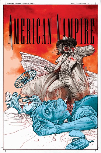
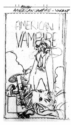
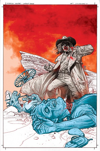
Below is the variant cover that I did for American Vampire #4 due out this week I think, presented in stages. This cover is being release as 1 in 25 ratio, so good luck finding a copy. Next week should see the release of the Batwoman: Elegy Hardcover, so I’ll be posting something fun for that soon.
Here is the rough sketch for the cover idea, done for editorial approval…
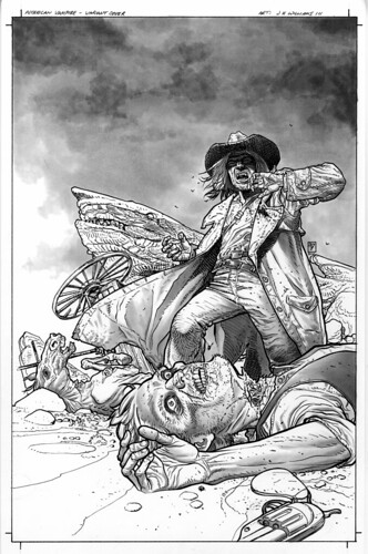
Here is the black and white version, I wanted an image that was equally strong in this form as well as color because I was really going to rely on the style of the drawing and rendering to carry the color idea through.
This is the color version done by me. I wanted the color use to be unusual. I knew I wanted to use red, white, and blue to be viewed on the cover in that order, from top to bottom of the image. This is the order that we refer to America’s colors in conversation in this country, so it was key to get that across. But I was also dealing with a western image, so using that palette was difficult. But ultimately the strategic placement of those colors and using them in a such surrealist way in tandem with the more traditional western looking comics art really gives it that psychological punch. Bringing it more into a horror concept beyond just the gore of the scene…
Then here is the final version with the logo in place…